If you’ve followed Pyrois Media for any length of time, you probably recognize the defining feature of our logo – the Pyrois ball.
The red Pyrois Media ball was the very first thing I knew I had to have when I named Pyrois Media. It represents the name perfectly in my mind – Pyrois Media is named after one of the mares who helped Greek god Helios pull the sun around the world every day and the ball combines those two things.
I’ve talked about why I picked Pyrois’s name out of Helio’s four mares in a past blog (if you think Pyrois is a confusing name, you should look up the names of the other three horses!) and the ball was set to represent both her and the company. The red is the sun while the horse represents Pyrois herself, a perfect combination of everything I was going for.
While technically Pyrois was a carriage horse, I felt that leaving all equipment off her was the best option. Not only would equipment have made for a messier logo but my goal has always been to open Pyrois Media up to all clients in (and out) of the equine industry and I felt that letting her stay free of any equipment represented that better than anything else could.
But I’ll let you in on a little secret – the model for Pyrois Media’s logo wasn’t a mare.
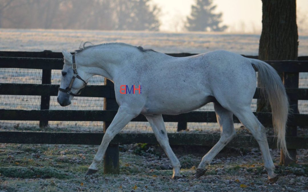
The logo’s model is multiple graded stakes winner Fort Prado, who stood at stud for many years. During his stallion career, one of his locations was Buck Pond Farm where I was able to visit him as he was being turned out one frosty morning in late 2015.
As many horses do when they’re first turned out and there’s a camera around, he put on a show and his trot made for a lovely picture.
I had a few different requirements for the ball – it must be red, and it must not represent any discipline. I was starting out Pyrois Media in the racing industry, but a running horse seemed to send the message that racing was the only discipline it would serve, which I wanted to avoid. Red Mare Marketing’s Meagan Dean and I brainstormed different kinds of stances that would work for the ball and looked at a few different photos I had taken as inspiration with Fort Prado’s giving me an “ah ha!” moment.
Over the years, I’ve grown to really appreciate how familiar the ball will be for any horseperson. Who hasn’t seen their horse do the extended, snorty trot when first turned out on a cold winter day?
For the logo redesign in 2022, I gave Norfleet Marketing’s Kelsey Keathly mostly free rein because she’s so familiar with Pyrois Media, but I had one requirement – the ball must stay, and it must still be red. As you can see, the new secondary logo is overall different from the one designed in 2018, but other than a slight shade change, Fort Prado still reigns supreme every time it makes an appearance!